
← PORTFOLIO |
Almosafer · Fare Families
A product story · Maryam Richards
A flight booking story

What if choosing a flight felt less like
comparing numbers — and more like
choosing a travel experience?

Departures · Flight selection● live
SV 553Riyadh → DubaiA12On timeSAR 980
MS 712Jeddah → CairoC04On timeSAR 1,120
EK 802Dubai → LondonB21BoardingSAR 2,340
QR 118Doha → ParisD09On timeSAR 2,010
TK 145Istanbul → RomeA07DelayedSAR 1,540
GF 273Bahrain → MaleC16On timeSAR 1,860
SAR 980 SAR 1,120 SAR 1,340 SAR 890
01 — The trigger

Thousands arrive at the flight screen with one goal — find the right flight.

But most were deciding on price alone. The cheapest fare won, every time.

MY ROLE ON THIS
ROLESenior Product Designer
02 — The disconnect

They weren't buying a flight.
They were buying a travel experience.

The OTA booking funnel
Searches flights
Compares fare options
Hesitates — unclear value
Books on the airline site
↘ lost to the airline's own website
What they actually wanted

Refundable & flexible fares

"Covid changed how I travel."

Clear fare comparison

"More baggage for a good price."

Miles & cabin upgrades

"Higher fare, more miles to upgrade."

03 — From price to value

We made every fare comparable.

flight · 1 of 1 · < swipe for more >
Cabin bag
Checked bag
Seat choice
Refundable
Date change
Extra miles
Saver
SAR 980
The lowest fare
7kg
At check-in
Non-refundable
Fee applies
RECOMMENDED
Comfort
+ SAR 220
Most popular
7kg
23kg
Standard
Free once
+50%
Flex
+ SAR 540
Total freedom
7kg
30kg
Extra legroom
Fully refundable
Unlimited
+100%
04 — The experiment lab

We tested different ways to compare.

Three directions for the comparison UI — validated with real travelers and benchmarked against 8 airlines.
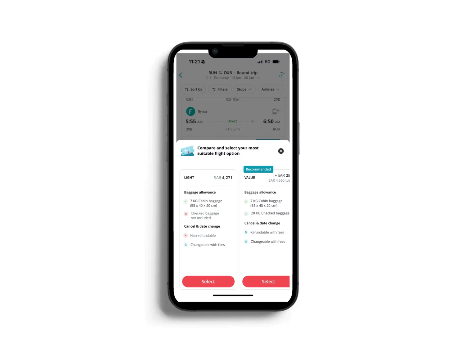
V1
Side-by-side bottom sheet
Phase 01 · Visibility

Side-by-side bottom sheet

Quick compare without leaving the results list.
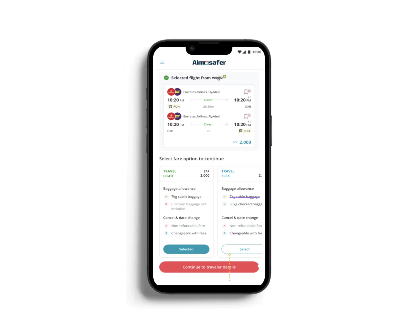
V2
Full-page fare comparison
Phase 02 · Familiarity

Full-page fare comparison

All options in one view — mirrors airline sites.
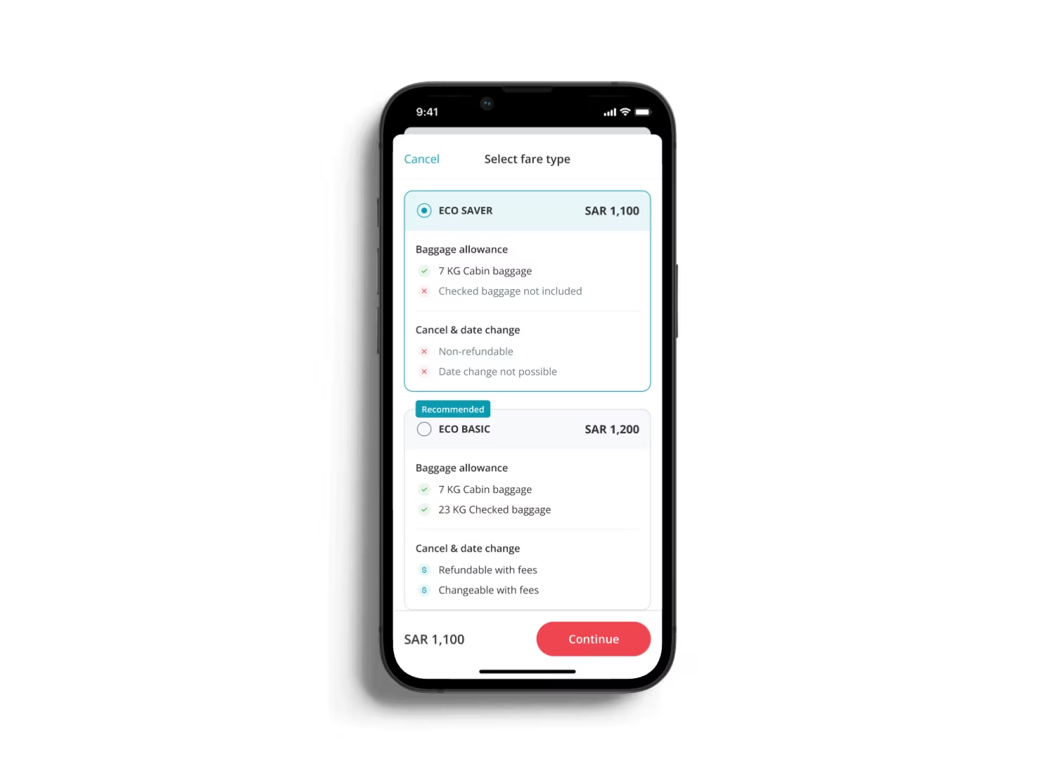
V3
Stacked fare selector
Phase 03 · Scalability

Stacked fare selector

Scales cleanly across many fares and providers.

Each round sharpened the design that shipped →
What didn't work: V1's bottom sheet tested fastest, but travelers couldn't see enough to trust it — speed without confidence didn't convert either.
05 — The tradeoffs

Every choice had a cost.

Designing fare upsell inside an OTA means holding tensions honestly — not pretending they don't exist.

Aggregation vs accuracy

Every airline structures bundles differently. Normalizing 8 carriers into one comparable model meant simplifying some carrier-specific perks — a loss we accepted for clarity.

Revenue vs trust

Upsell pressure invited pre-selected upgrades. I refused the dark pattern: Saver stays the default, and higher fares must be an informed, deliberate choice.

Detail vs decision speed

Full fare rules overwhelm on mobile. I committed us to six comparable attributes up front; edge-case rules live one tap deeper — faster decisions, slightly less exhaustive.

06 — Takeoff · what we shipped

A clearer way to choose.

+0%
Increase in targeted upsell interactions
+0.0%
Add-on attachment rate — the follow-on work in the same booking flow

The challenge wasn't selling more.
It was helping travelers understand what they were buying.

Next: the same comparison logic doesn't stop at the fare — baggage, seats and other ancillaries have the exact same "which one is actually better" problem, unsolved.
Maryam Richards · Senior Product Designer · Almosafer
Let's find your flight.
Click anywhere — or press → — to continue
1 / 8 · Intro